Craigslist
A UX/UI redesign of Craigslist, tailored for both mobile and desktop platforms. This project focuses on building trust, streamlining navigation, and improving usability—while maintaining the functionality that longtime users rely on.


Case Study
-
Craigslist has remained virtually unchanged since its early 2000s debut. While its minimalist approach once stood out, today it leads to a lack of clarity, trust, and overall usability. My goal was to redesign both the desktop and mobile experiences with a clean, accessible interface that meets modern user expectations—without losing the core simplicity Craigslist is known for.
Confusing layout with no visual hierarchy
Unintuitive navigation structure
Not mobile-optimized
-
To ground the redesign in real user needs, I conducted interviews and usability testing on the current site. I also explored competitors like Facebook Marketplace and Depop to understand how modern peer-to-peer marketplaces are designed.
Users frequently use Google to find their city’s Craigslist page
People feel nervous trusting listings due to the outdated design
Navigation and filters were described as “messy” of nonexistent”
-
In my competitive analysis, I examined Depop, Facebook Marketplace, and the original Craigslist to identify strengths and weaknesses that could inform the redesign. Depop offers a visually engaging and user-friendly interface tailored for fashion enthusiasts, while Facebook Marketplace benefits from seamless integration with social networking features and a vast user base. In contrast, the original Craigslist, despite its simplicity and extensive reach, suffers from an outdated interface and limited search capabilities. By analyzing these platforms, I aim to incorporate the best elements of each, creating a more intuitive and appealing Craigslist experience.
-
Pain Points
Outdated, text-heavy interface.
Difficult navigation, especially for new users.
Poor mobile responsiveness.
Lack of personalization or customization options for frequent users.
-
Increase user engagement and retention.
Improve brand perception by modernizing the user interface.
Differentiate from competitors like Facebook Marketplace and Depop.

Persona
-
Key Questions Addressed
What are the main tasks a user needs to accomplish (e.g., posting, searching, contacting)?
How can we streamline the process for each of these tasks?
What features will help users achieve their goals with minimal friction?
-
Using the user stories as a foundation, I developed three user flows to address common pain points:
Simplified Posting: A step-by-step process that allows users to create a listing quickly, with suggestions for optimizing their post.
Enhanced Search: Improved filtering and sorting options to help users find what they’re looking for more easily.
Customizable Dashboard: A personalized homepage that shows relevant listings based on user preferences and past activity.

Wireframes
-
Main Content Area: Features a prominent search bar with category filters and location settings. Below, there’s a section for featured or popular listings.
Sidebar: Displays quick links to popular categories and user account options.
-
Image Carousel: Users can swipe or click through images to view details.
Contact Button: Prominently displayed for users to contact the seller directly.
Simplicity: Streamlined design to avoid clutter and make navigation intuitive.
Consistency: The wireframes maintain a consistent layout and functionality across different sections and devices.

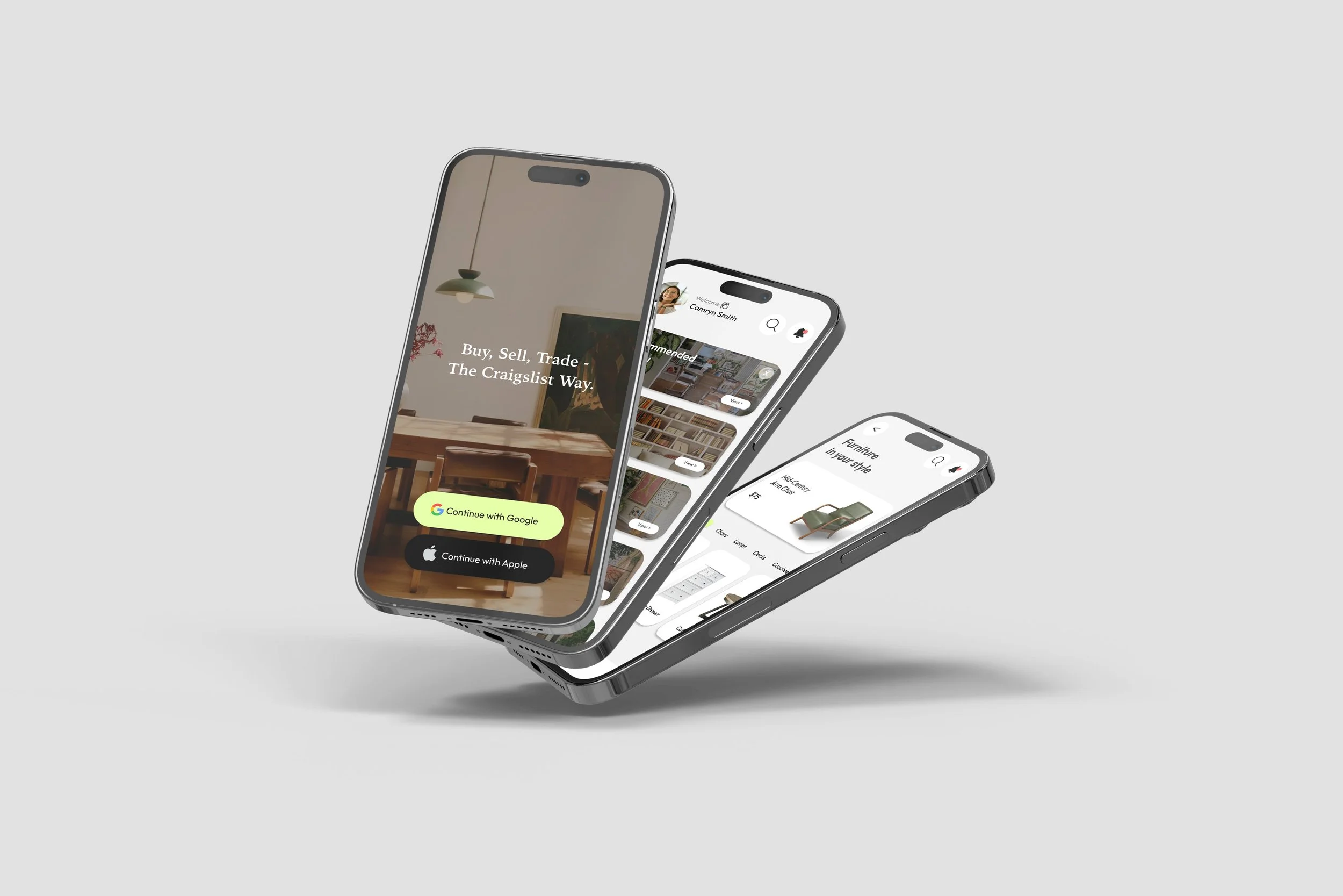
High Fidelity Prototype
-
For the redesign, I focused on keeping the aesthetic minimal and user-friendly while updating the color palette and typography to feel modern and approachable. The design evokes trust and ease of use, ensuring that Craigslist remains familiar to its long-time users but also appealing to newer audiences.
Solutions
-
Improved Search Filters
Improved filters: Customer testimonials allow the site to feel more trustworthy and community based.
Homepage refresh: Clear descriptions about the purpose of the site, customer testimonials and access to the sign up page.
-
Streamlined Posting
A restructured posting flow breaks down the process into simple steps, with hints and tips to help users create more effective listings.
-
Mobile-First Design
Mobile-first thinking: Responsive design that adapts to all screen sizes. While Craigslist is known for its utilitarian style, I introduced a refreshed interface that uses grid layouts, soft color palettes, and modern typography. The redesign respects the site's original DNA, while making it more digestible and reliable.
Takeaways
Designing for both desktop and mobile platforms challenged me to think responsively from the start. I learned how to modernize an established interface without alienating its original user base, and how small UX decisions- like clairity in hierarchy or visible CTAs- can radically improve trust.